Media and controls
Introduction
Every detail page starts with one 3D entry. Add image, native video or YouTube entries with unique IDs:
media: [
  { id: 'model', kind: 'minimap', label: '3D view' },
  { id: 'front', kind: 'image', label: 'Front view', src: '/front.webp',
    thumbnail: '/front-small.webp', fit: 'contain', alt: 'Front of the enclosure' },
  { id: 'assembly', kind: 'video', label: 'Assembly', src: '/assembly.webm', poster: '/assembly.webp',
    captions: [{ src: '/assembly-en.vtt', language: 'en', label: 'English', default: true }] },
  { id: 'demo', kind: 'youtube', label: 'Demonstration', videoId: 'M7lc1UVf-VE' }
]
An omitted 3D entry is inserted; duplicate minimap entries are ignored for presentation.
Images need meaningful alt text. Use native WebVTT tracks for relevant audio. Replace the
old source-less drawing entry with a real image; missing source
data produces an unavailable message.
Provide an optional thumbnail for each image to keep the media selector light.
The rail loads these previews lazily; selecting an image uses its full src. A
small poster serves the same purpose for videos. Without a thumbnail, the rail uses
the image source directly.
Set fit: 'contain' (the default) for cut-out product images, or fit: 'cover' for photographs that should fill their frame. The same setting applies
to the thumbnail and the stage. Cover preserves proportions but crops the edges. Only the selected
media item is outlined. A cube identifies the 3D view; a play symbol identifies videos. Overflow
arrows scroll the rail without moving the page.
The live minimap retains its spatial hover response. Image and video panels stay still: contained product images have an 8px inset and expand to the frame on hover, keeping the entire product visible. Cover photographs fill the panel and zoom by the same 8px per side. Video previews gently zoom and enlarge their play symbol. These movements respect reduced-motion preferences.
Gesture ownership
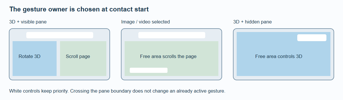
White UI controls retain their own input. A gesture keeps its initial owner until release.
| State | Free-area gesture |
|---|---|
| Flow detail, 3D | Model contact rotates; outside scrolls |
| Split detail, 3D | Left of pane controls 3D; pane scrolls |
| Split zoom, hidden pane | Entire free viewport controls 3D |
| Image/video | Free areas scroll the document |
| Native or embedded player UI | Player owns its controls |
Ownership is selected at gesture start and does not flip when the finger crosses a region boundary. Menu, rail, pane and real player controls always take priority over model interaction.
Device orientation
SpatialCardGridSection and SpatialCarouselSection enable device orientation automatically;
they have no deviceOrientation prop. Set deviceOrientation on BrandStageShell
to enable detail geometry and minimaps as well. Access starts automatically where allowed. If
explicit permission is needed, the framework requests it during a trusted internal navigation
gesture without delaying navigation. Denial, missing sensors and reduced motion leave ordinary
interaction available.
Device rotation is calibrated, smoothed and bounded. Orientation changes reset the reference. Scrolling pauses application, and release establishes a new reference before the effect fades back in.
The carousel uses a subtle shared view change with stronger rotation of the active item; mouse proximity still rotates individual items. Sensor behavior on real Android, Surface and iOS hardware requires direct checks. Desktop automation does not prove sensor axes, permission prompts or mobile browser-toolbar performance.
The executable /docs/examples/media/ fixture covers selected-media layout, player
teardown, failure states and hidden-scene rendering. Its YouTube test uses a controlled iframe
fixture; it does not claim validation of the remote service.