Section backgrounds
Introduction
A Section owns its anchor, optional visible headline, grid padding and background. A navigation label and a displayed heading are different authoring choices.
<Section section={{ id: 'details', title: 'Details', headline: 'Made for everyday use',
  background: { color: 'standard', size: 'standard' } }}>
  <p>Section content.</p>
</Section>
id stays stable for links and history. title labels generated
navigation and accessibility. headline creates the visible heading. Omit headline to omit both the heading and its gap; padding remains. A section without
a visible heading still has an accessible name.
Background roles
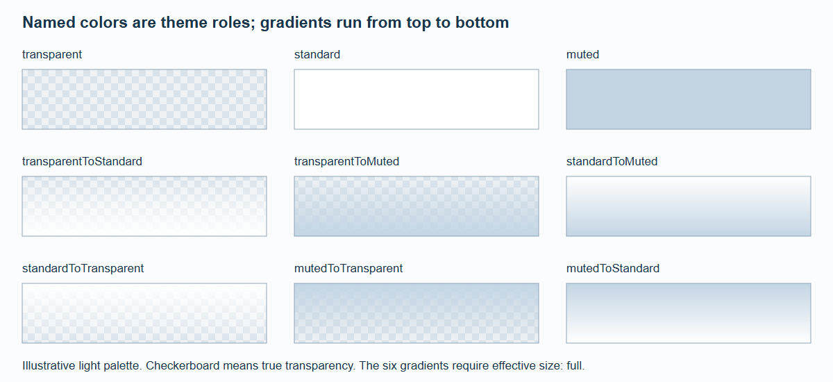
An illustrative light palette. Only effective full-width backgrounds support the six gradients; the theme supplies the actual standard and muted colors.
color | Result |
|---|---|
transparent | Actual transparency |
standard | Theme's standard section color |
muted | Theme's muted section color |
transparentToStandard, transparentToMuted | Top transparent, bottom named color |
standardToTransparent, mutedToTransparent | Top named color, bottom transparent |
standardToMuted, mutedToStandard | Vertical color-to-color gradient |
The default is transparent, standard width. size: 'full' extends only the background
across the page; content stays on its capped grid. It does not introduce horizontal scrolling
or stretch interactive content.
Detail sections always constrain backgrounds to standard width, including inside the 3XL
pane. A gradient is valid only when its effective background is full-width.
An invalid gradient becomes its end color and produces a deduplicated development
diagnostic. For example, transparentToMuted/full on a detail page becomes solid muted.
This deterministic fallback is an engineering choice, not a hidden change to the theme palette.
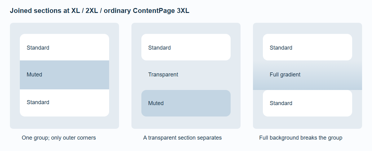
Changing opaque color does not split a group. Transparency and full-width backgrounds do.
Corners and spacing
At XL, 2XL and ordinary ContentPage 3XL, contiguous opaque standard-width sections share outer panel corners. Only the first top corners and last bottom corners are rounded. Each section contributes its own grid padding; there is no extra automatic outer gap.
The 3XL detail pane owns its outer corners, so its sections have no detached grouping corners. Transparent and effectively full-width sections also do not acquire these corners. Grouping follows registered section order, not arbitrary helper elements in the DOM.
Theme roles and compatibility
createSpatialTheme({
  id: 'collection', name: 'Collection',
  background: '#e7ebef',
  sectionBackgrounds: { standard: '#ffffff', muted: '#f3f5f7' },
  radii: { control: 12, panel: 16 }
});
Use a matching dark palette when supplying dark text/background roles. Section colors do not
change the glass material's tint. ContentPage background="..." overrides
that page's flat background for native and enhanced rendering while preserving lighting.
Legacy section.style is retained as an explicit compatibility path. Do not
silently replace a custom tint or blur with the closest named role. An explicit background takes precedence over legacy tint, opacity and blur; legacy width and text color still apply.
There is no diagnostic for combining those paths. The development diagnostic described above is
specifically for unsupported gradients. See Migration and Reference.