Spatial card grids
Introduction
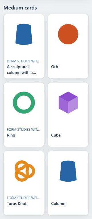
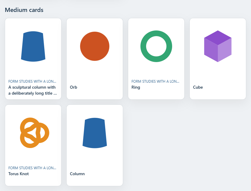
Cards use Page Sections 0.3.0. The media frame has its own configurable aspect ratio; the text area adds independent height. All cards in a collection have equal heights across rows.
- S: 2 columns, 12px title, two title lines, no eyebrow.
- M: 2 columns, 14px title, two title lines.
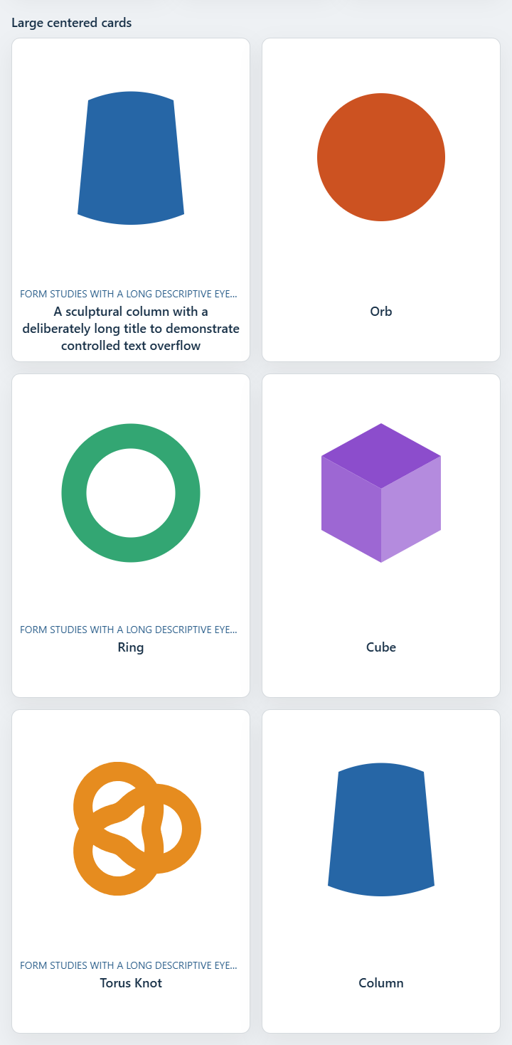
- L: 4 columns (3 in grid S), 18px title, three title lines.
- M/L reserve an additional eyebrow row for every item when any item has a nonblank eyebrow.
- Text padding is 12px; contained media has an 8px inset.
Use these options directly on SpatialCardGridSection (not inside section): cardSize="s|m|l", cardTone="standard|muted", textAlign="start|center", mediaAspect="1/1|3/2|4/3" and mediaFit="contain|cover". SpatialListPage forwards
all of them. cardVariant="catalog" (default) uses responsive
size-based spans; cardVariant="editorial" uses itemSpan (default { xs: 4, s: 3, m: 4, l: 4 }) and a title link. Spatial media
defaults to 1/1; Page Sections defaults to 3/2. Keep itemKey stable for repeated items and reordering.
<SpatialCardGridSection section={{ id: 'collection', title: 'Collection', headline: 'Collection' }}
  list={items} cardSize="l" mediaAspect="1/1" mediaFit="contain" cardTone="muted" />
Measured media and independent text
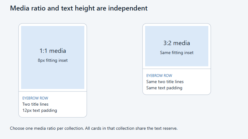
The media frame alone has an aspect ratio. At 320px, an M card is 142px wide, with a 126px square inset fitting area. With an eyebrow row the full card is 226px high. Blank eyebrows reserve the same line as populated items. Long titles clamp while the native link retains the full accessible title.
Spatial adapters measure the actual media element for geometry, camera fitting and transition targets. Format changes never stretch a model. Persistent card roots and occurrence identities survive navigation and keyed moves.
Interaction and fallback
Cards remain real links with posters and readable labels before hydration or GPU startup. Mouse proximity and device orientation remain spatial enhancements; keyboard focus, reduced motion and touch navigation retain their behavior.
Use /docs/examples/cards/ to switch all three media formats, filter labels and reorder
repeated element occurrences. Its browser checks cover container widths, equal heights and native
SSR.
Spatial component names and carousel fallback
Use SpatialCardGridSection and SpatialCarouselSection from @spatial-elements/sveltekit. The old SpatialCardGridSection and SpatialCarouselSection exports remain deprecated aliases for existing consumers.
Page Sections 0.3.0 also exports a 2D SpatialCarouselSection.
SpatialCarouselSection currently retains its own native scroll-snap fallback with posters,
accessible links, selected-item restoration and persistent interactive summary content. It
does not instantiate the Page Sections carousel: that component has a different
item/selection contract and no custom-card hook for the persistent spatial summary. Shared
section shells and layout tokens still come from Page Sections. SSR, unavailable GPU and
device loss all use the same native spatial carousel markup.
Opaque section backgrounds sit below the rear GPU models. Rendering, shadows and pointer
regions follow the section surface: background.size: 'standard' clips to the
section bounds; 'full' extends horizontally to the viewport. Both clip vertically
to the section. This also applies to transparent backgrounds. Layout measurements are cached and
adjusted numerically while scrolling.